Turning viewers into subscribers: A 64.1% Lift in Plus plans conversion
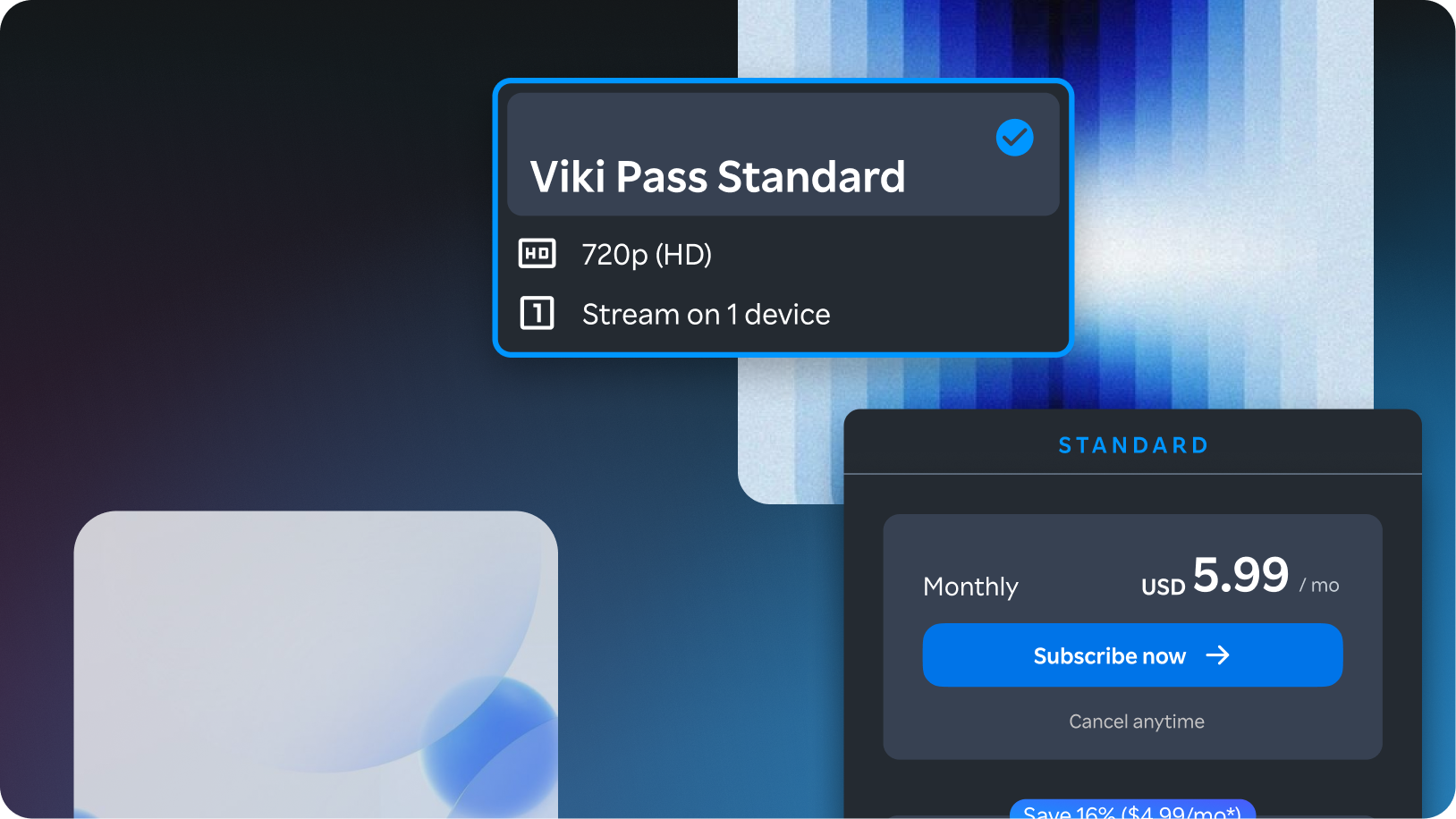
Viki Pass Standard plan card, floating over a blue gradient backdrop

Impact

Metrics measured

64.1% relative increase in Monthly (Plus) subscriptions

9.9% lift in ARPU (Average revenue per User)


Context

Facing Ambiguity:

Our Plans & Pricing page was overdue for a redesign, and the brief was clear on the What - improve conversion - but not the How.

There was no existing hypothesis, no prioritized list of problems.


I led a cross-functional workshop, bringing together the Director of Product and 2 engineers, to align on What Success looks like.
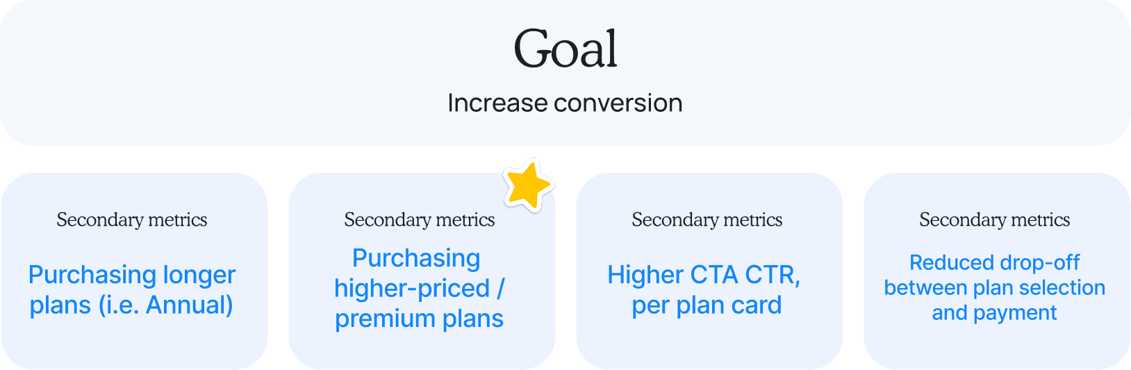
Goal: Increase conversion, with four secondary metrics — purchasing longer plans, purchasing higher-priced plans, higher CTA CTR per plan card, and reduced drop-off between plan selection and payment

We then generated hypotheses for each stage of the funnel.
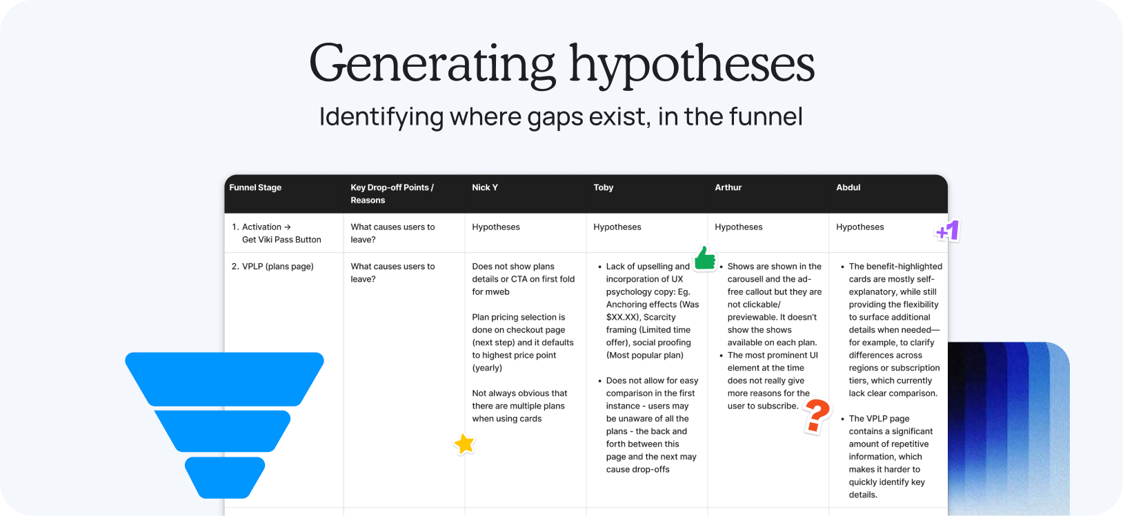
Funnel stage table listing key drop-off points and hypotheses from each team member, for Activation and the VPLP plans page

We prioritized these top 3 problems to solve:
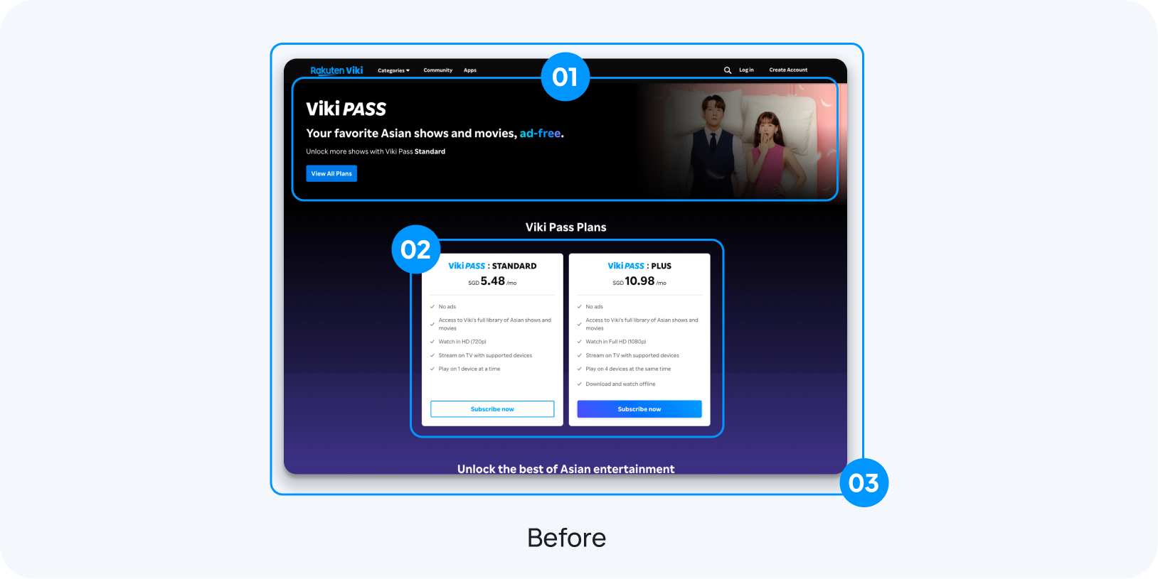
Before: the existing Viki Pass Plans page, annotated with three numbered problem areas — the hero banner, the plan cards, and the lack of persuasive UX copy

1. Hero banner is under-performing

Occupies premium above-the-fold real estate without delivering informational or persuasive value in return.

2. Plan differences aren't scannable

Wordy; users can't compare tiers at a glance, adding friction to the decision.

3. Lacking UX psychology guidance to sell plans.

Does not steer users toward higher-value plans, missing a monetization opportunity.
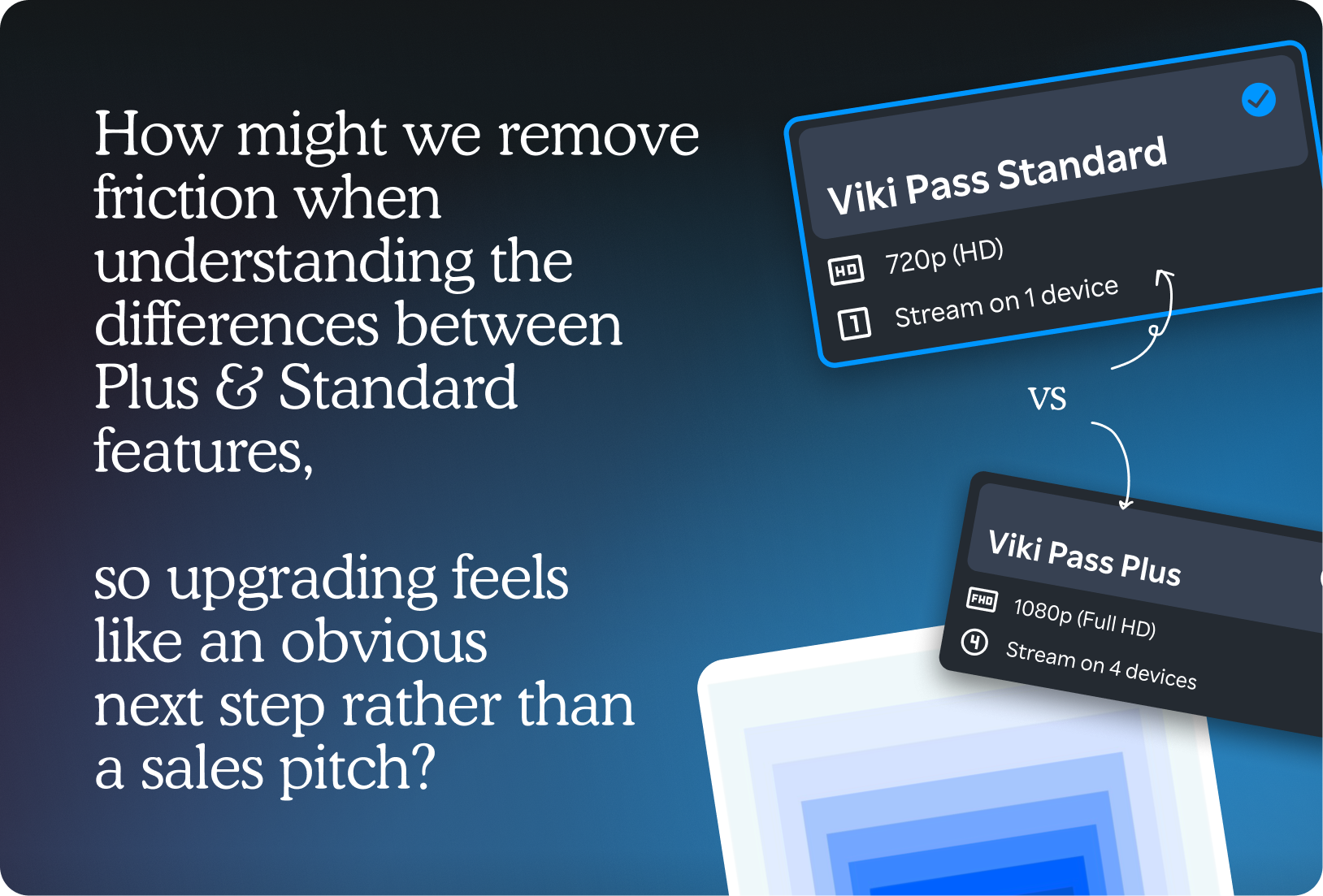
How might we remove friction when understanding the differences between Plus & Standard features, so upgrading feels like an obvious next step rather than a sales pitch — Viki Pass Standard card compared against Viki Pass Plus card
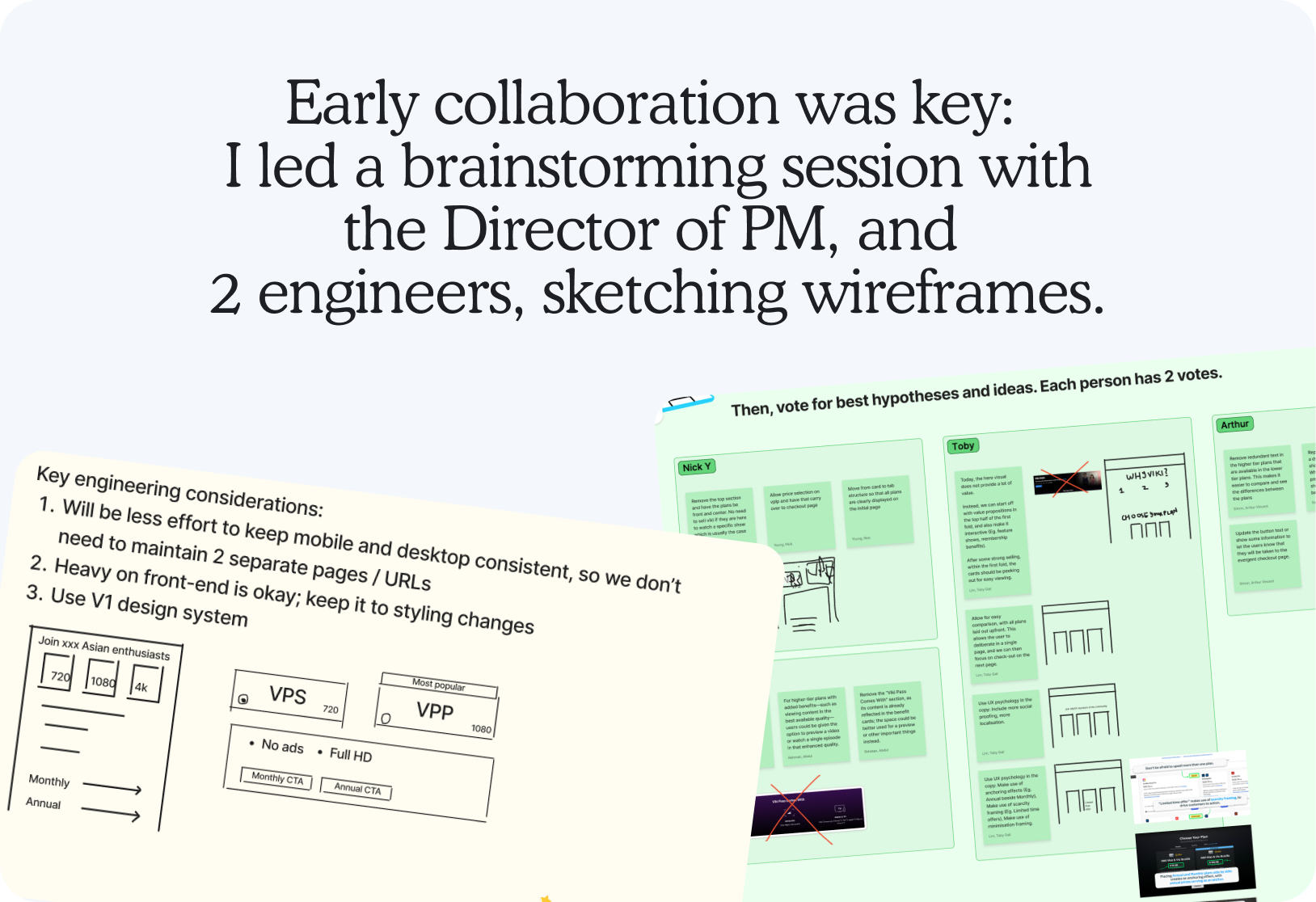
Early collaboration was key: I led a brainstorming session with the Director of PM, and 2 engineers, sketching wireframes. Workshop artifacts — key engineering considerations, low-fidelity wireframes, and sticky-note voting on the best hypotheses and ideas

We explored various experimentations of the cards, each based on different hypotheses.
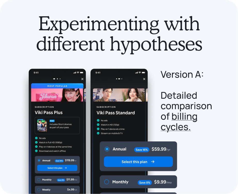
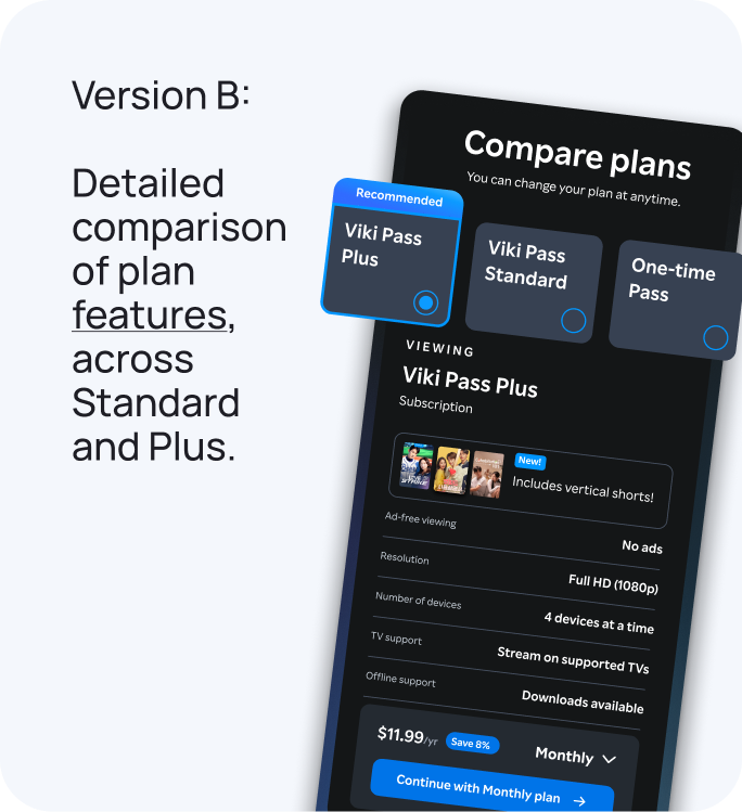
Version A: a detailed comparison of billing cycles, with Annual and Monthly options shown as mobile subscription screens Version B: a detailed comparison of plan features across Standard and Plus, in a compare-plans screen
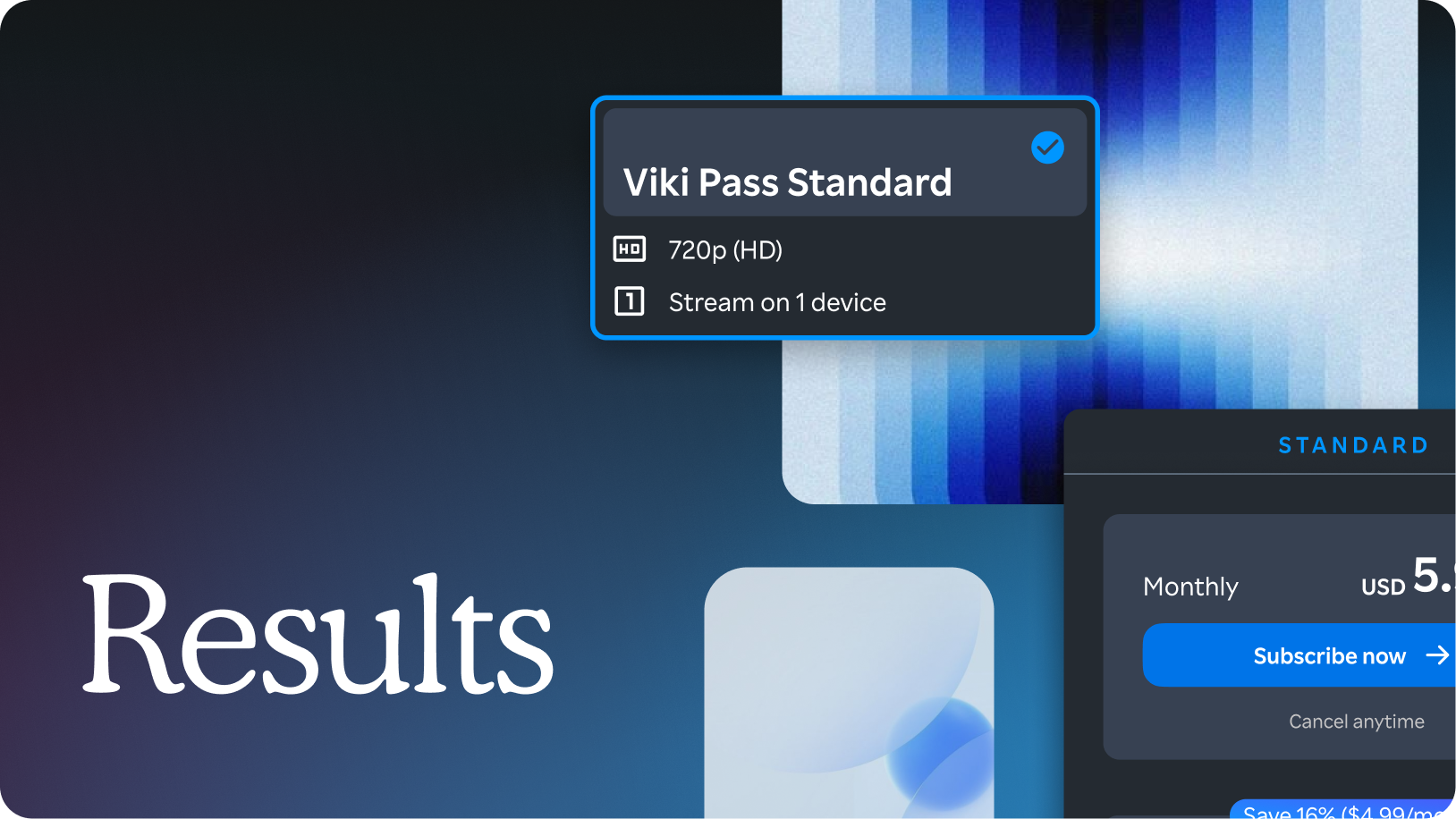
Results — Viki Pass Standard plan card floating over a blue gradient backdrop
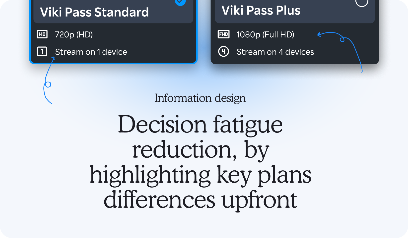
Information design: Decision fatigue reduction, by highlighting key plan differences upfront — Viki Pass Standard and Plus cards annotated to show resolution and device-count highlighted upfront
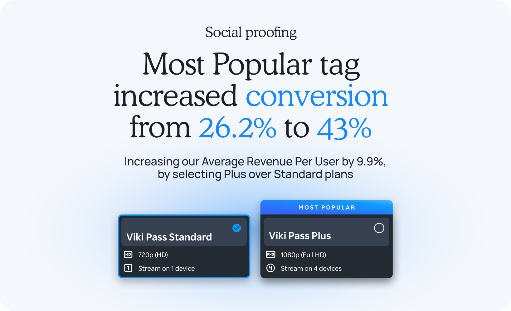
Social proofing: Most Popular tag increased conversion from 26.2% to 43%, increasing Average Revenue Per User by 9.9% by selecting Plus over Standard plans
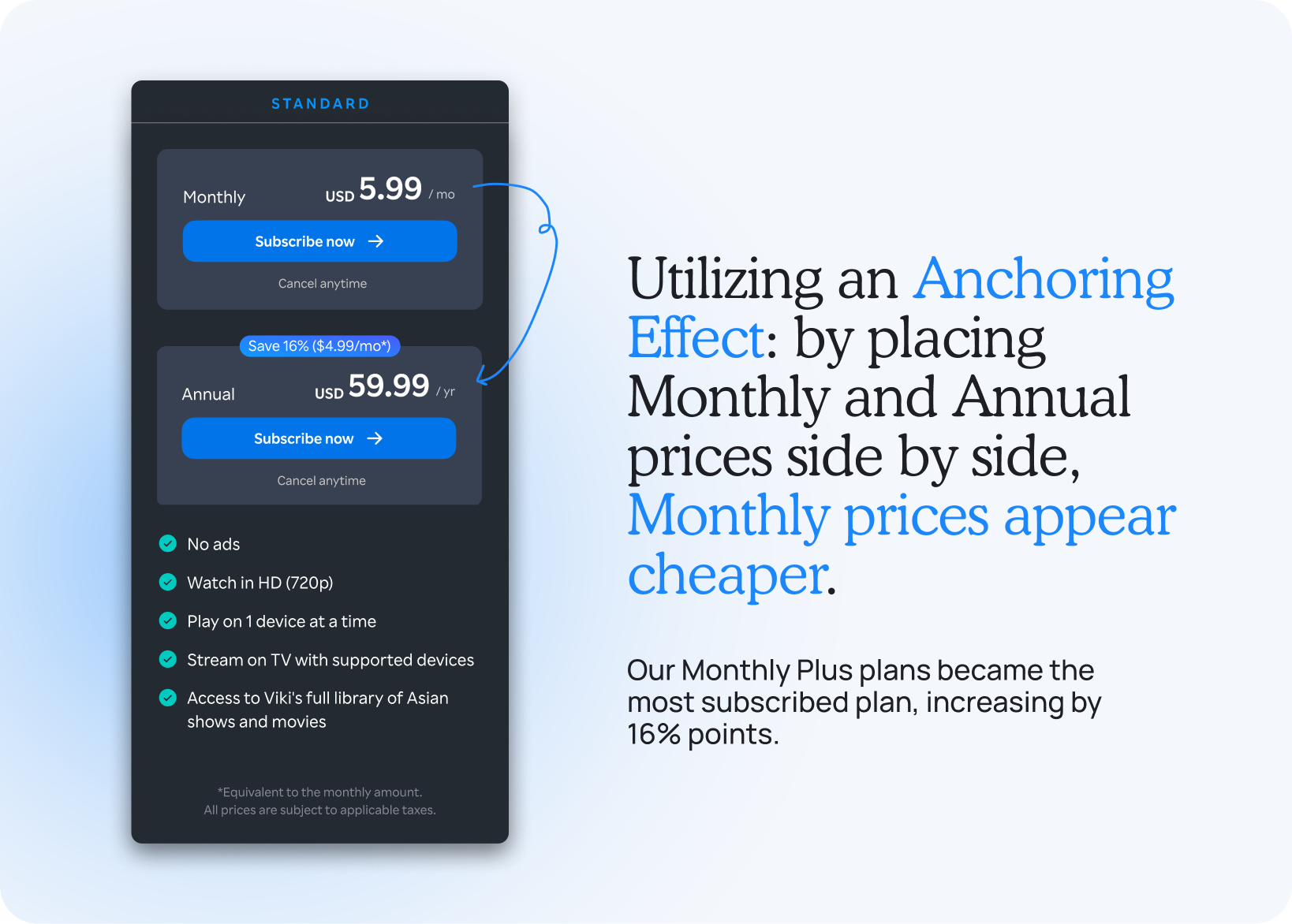
Standard plan's Monthly and Annual prices shown side by side, using an anchoring effect to make Monthly prices appear cheaper — Monthly Plus plans became the most subscribed plan, increasing by 16 percentage points
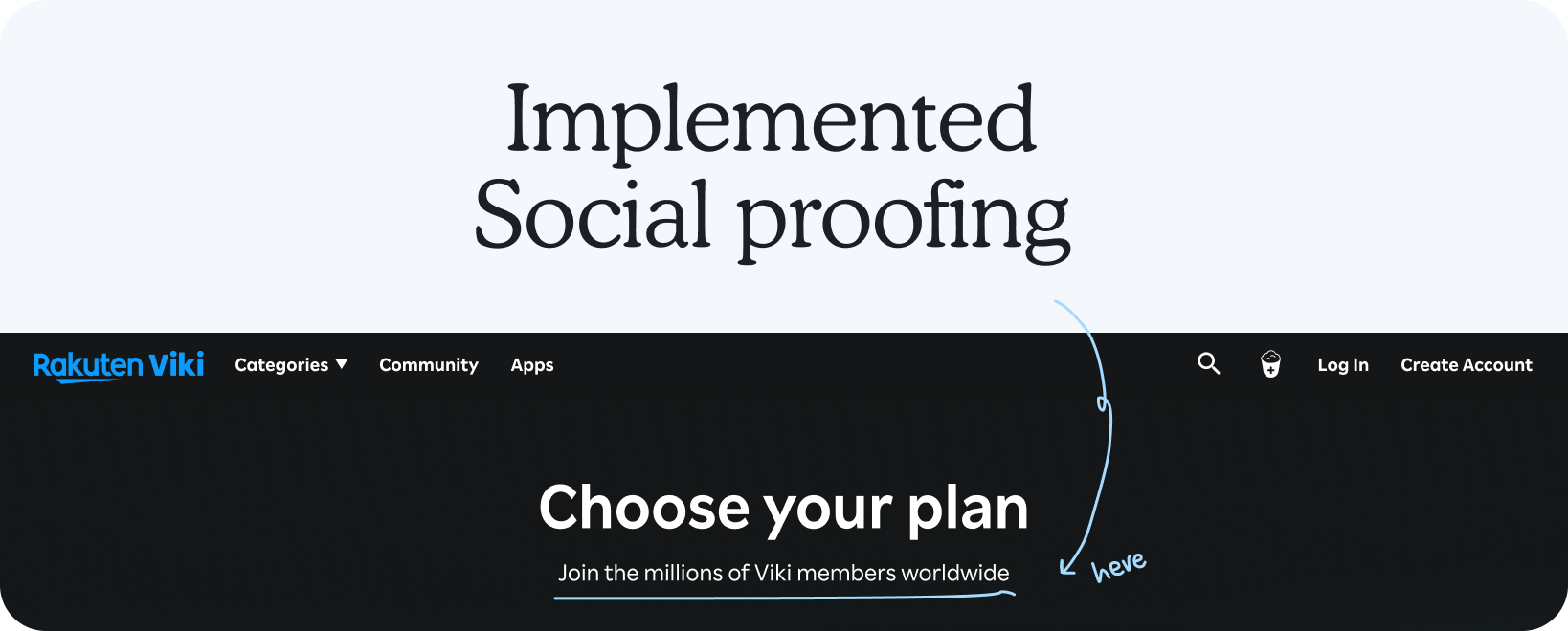
Implemented social proofing: the Rakuten Viki 'Choose your plan' page, annotated to point at the Most Popular tag
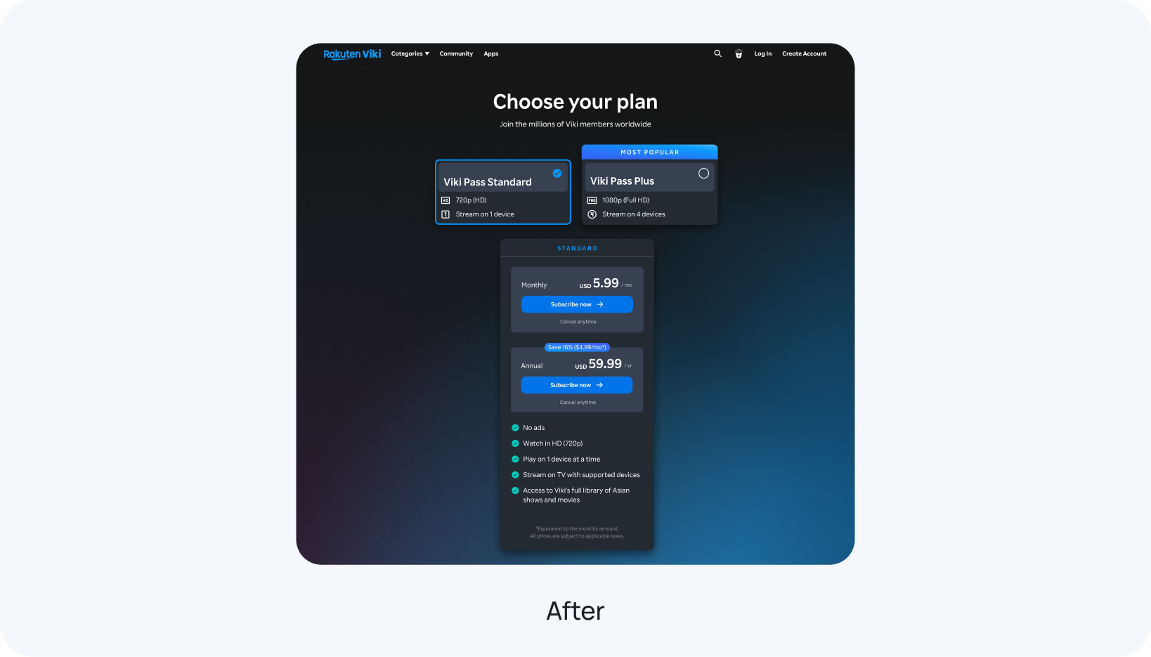
After: the redesigned Choose your plan page, with Viki Pass Standard and Plus cards, and a detailed Standard plan breakdown

Learnings

Facing an ambiguous brief taught me to lead with alignment first, bringing Product and Engineering into the same room before a single pixel was drawn.

Marrying UX psychology principles, like anchoring and social proof, with a rigorous, hypothesis-driven process turned a vague ask to "improve conversion" into a 64.1% lift in Plus plan subscriptions.