Helping firefighters and nurses focus on saving lives
Reducing task completion time by over 28%, and increasing feature adoption by up to 150%.
Efficiency
-28.58%
Reduced task completion speed
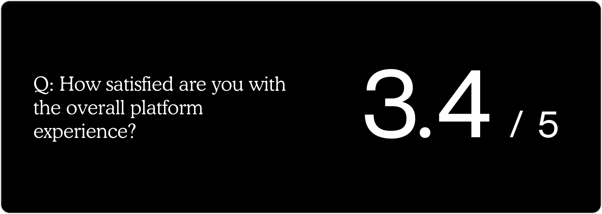
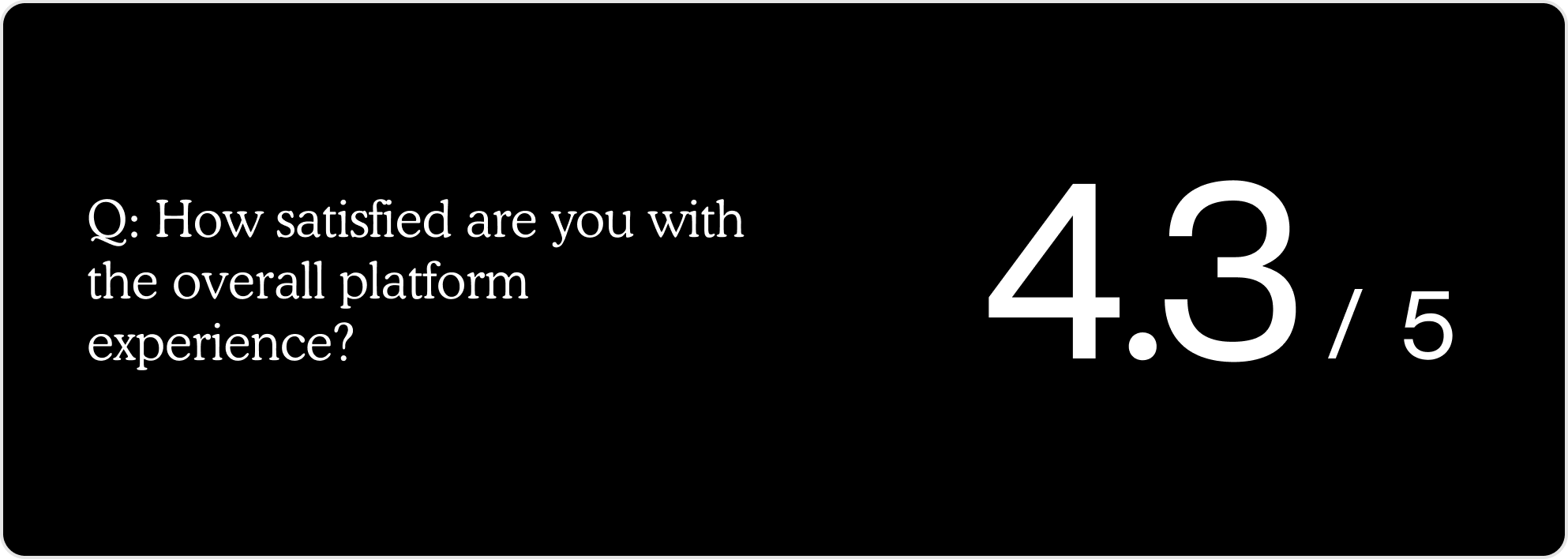
User satisfaction
4.3/5
Increased from 3.4 to 4.3
Feature adoption
68%
Reminders closure rate increased by 68%
Feature adoption
153%
Issues closure rate increased by 153%
01 Context
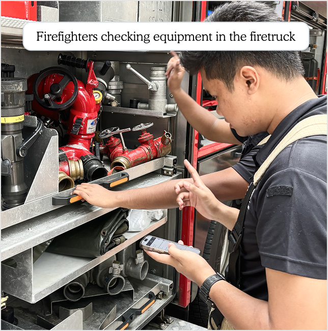
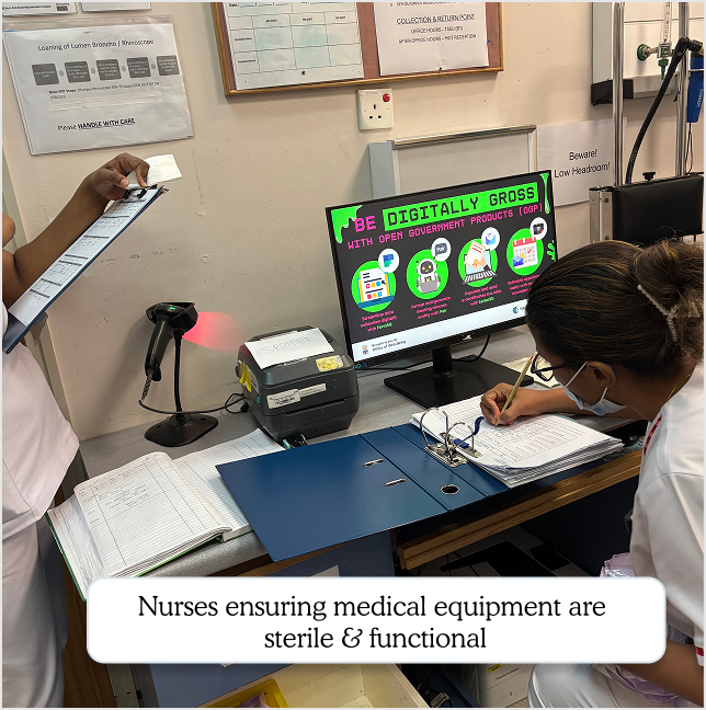
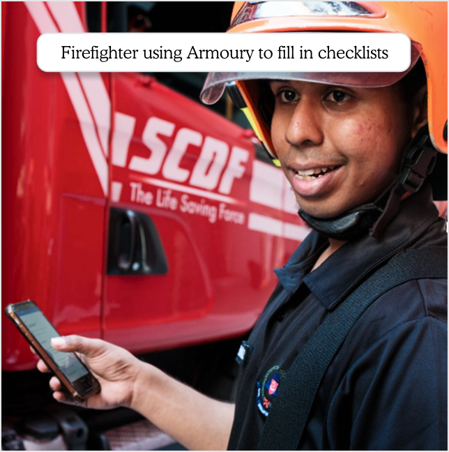
Firefighters and nurses conduct checks, at the start of every shift.
They check each equipment, 1 by 1, to ensure it's working. They use this product called Armoury, to fill in that checklist.
All to ensure they can save you and your loved ones' lives, during emergencies.
02 Diagnosing the root cause behind a low satisfaction score
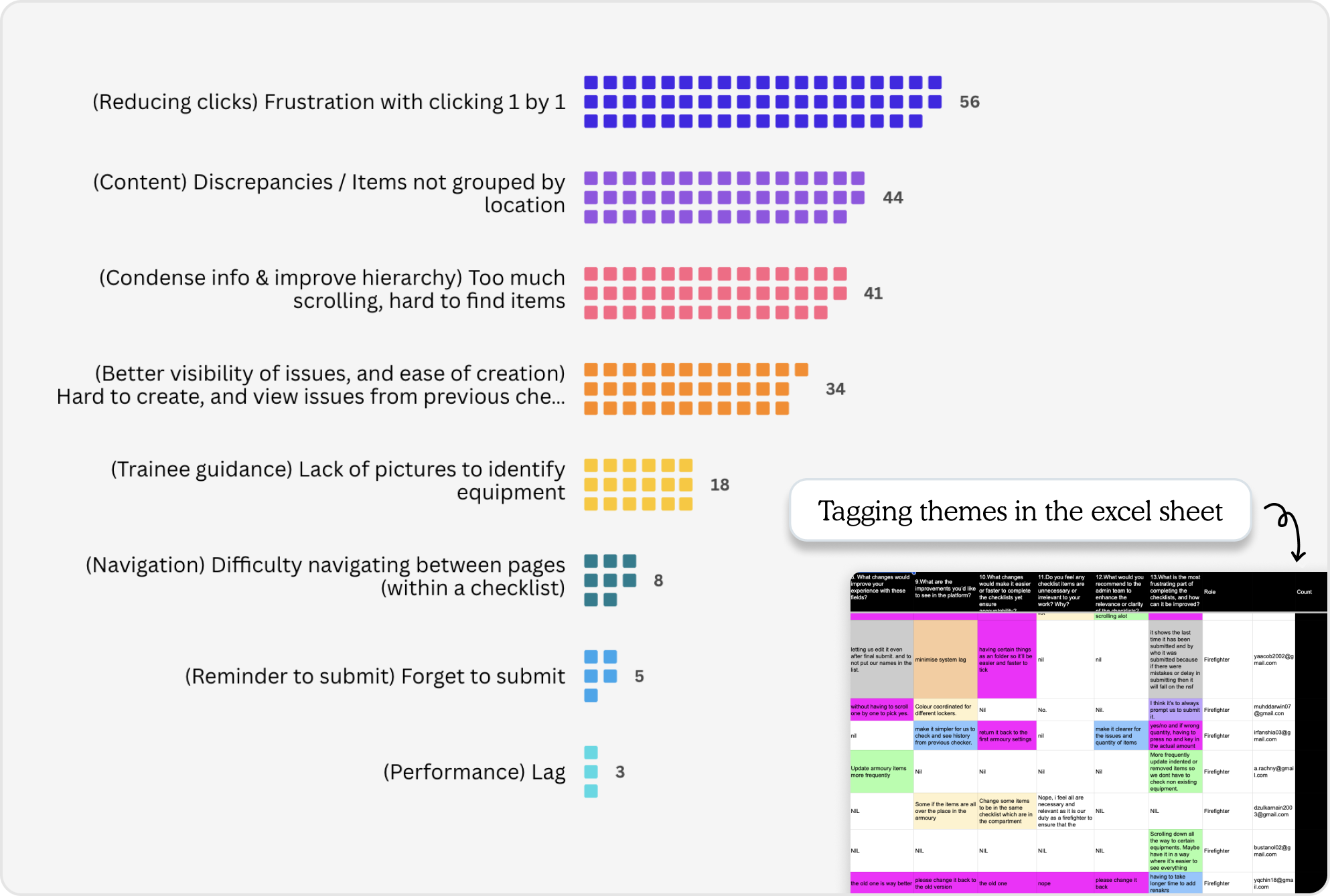
Upon joining the product, Armoury's satisfaction score was low, and task time was high. Issues and Reminders features were not being used.
I helped my Product Manager to understand why.
I scoured through our survey — tagged each piece of written feedback to create thematic categories.
03 Prioritising and wearing the PM hat: Gathering data on impact, writing out our bets…
Being in a small start-up team, meant that a designer takes on a Product Manager's tasks sometimes.
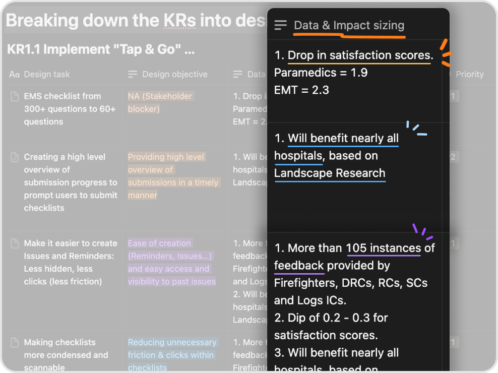
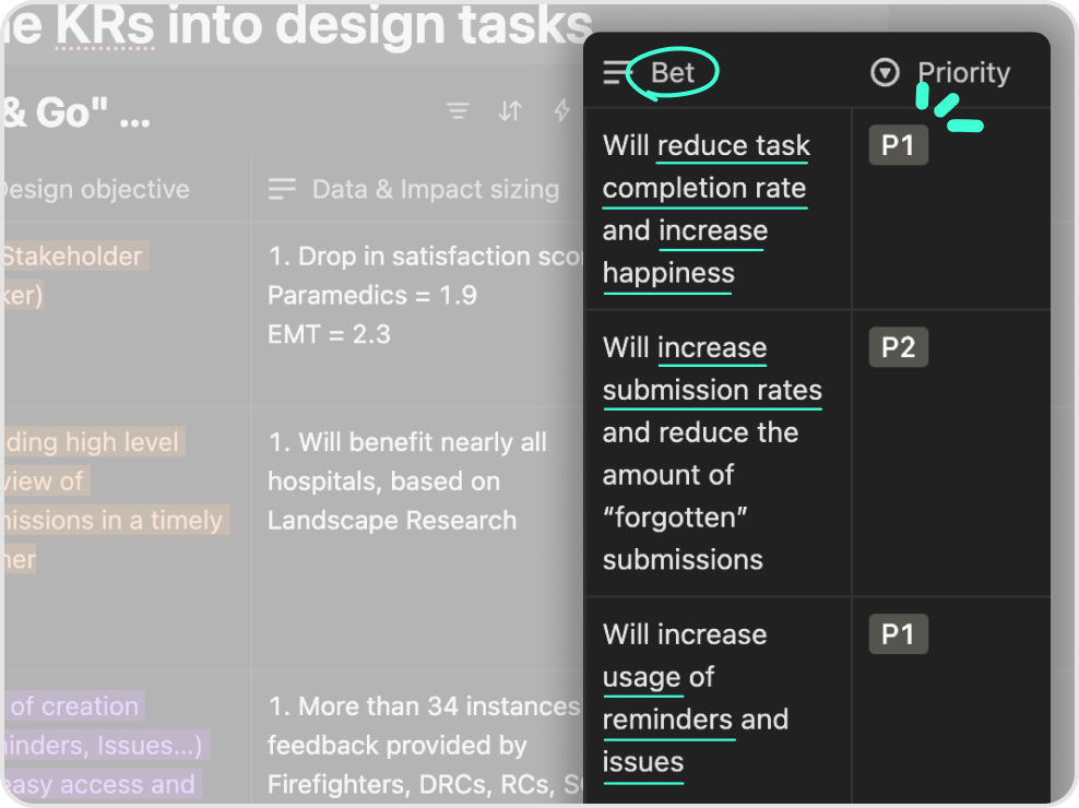
Then, I sorted these themes into backlog tasks.
I collated the following to create P1, P2 and P3 tasks:
- Design Objective
- Data & Impact Sizing
- The Bet / Metric we want to move
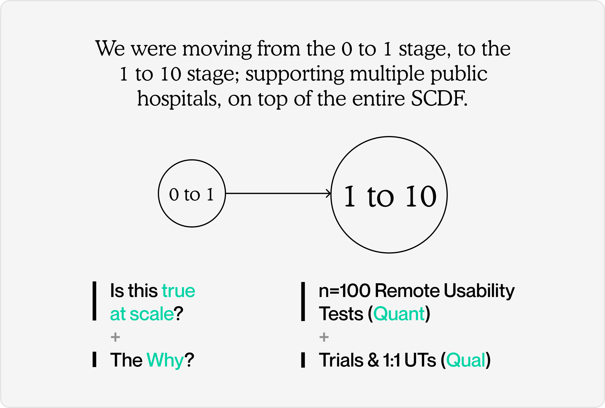
04 Selecting methodology based on product maturity
I validated the designs two-fold, with both Quantitative and Qualitative research:
- Target of n=100 Remote Usability Tests (Quant) +
- Trials & 1:1 UTs (Qual)
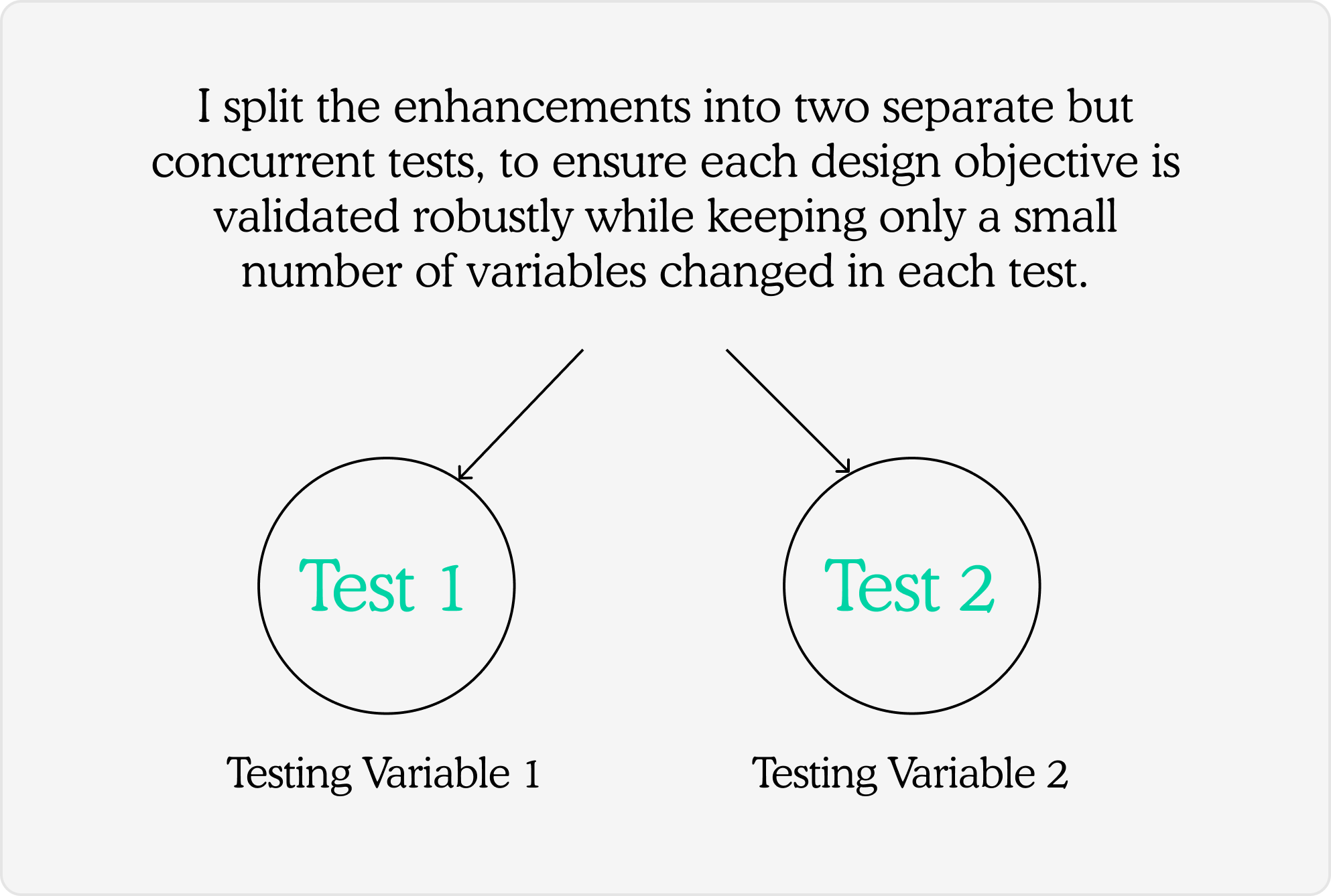
There were also multiple design objectives to be met. To ensure we validate each one of these robustly, I split our enhancements into 2 separate tests.
Each test has its own set of variables.
Test 1
05
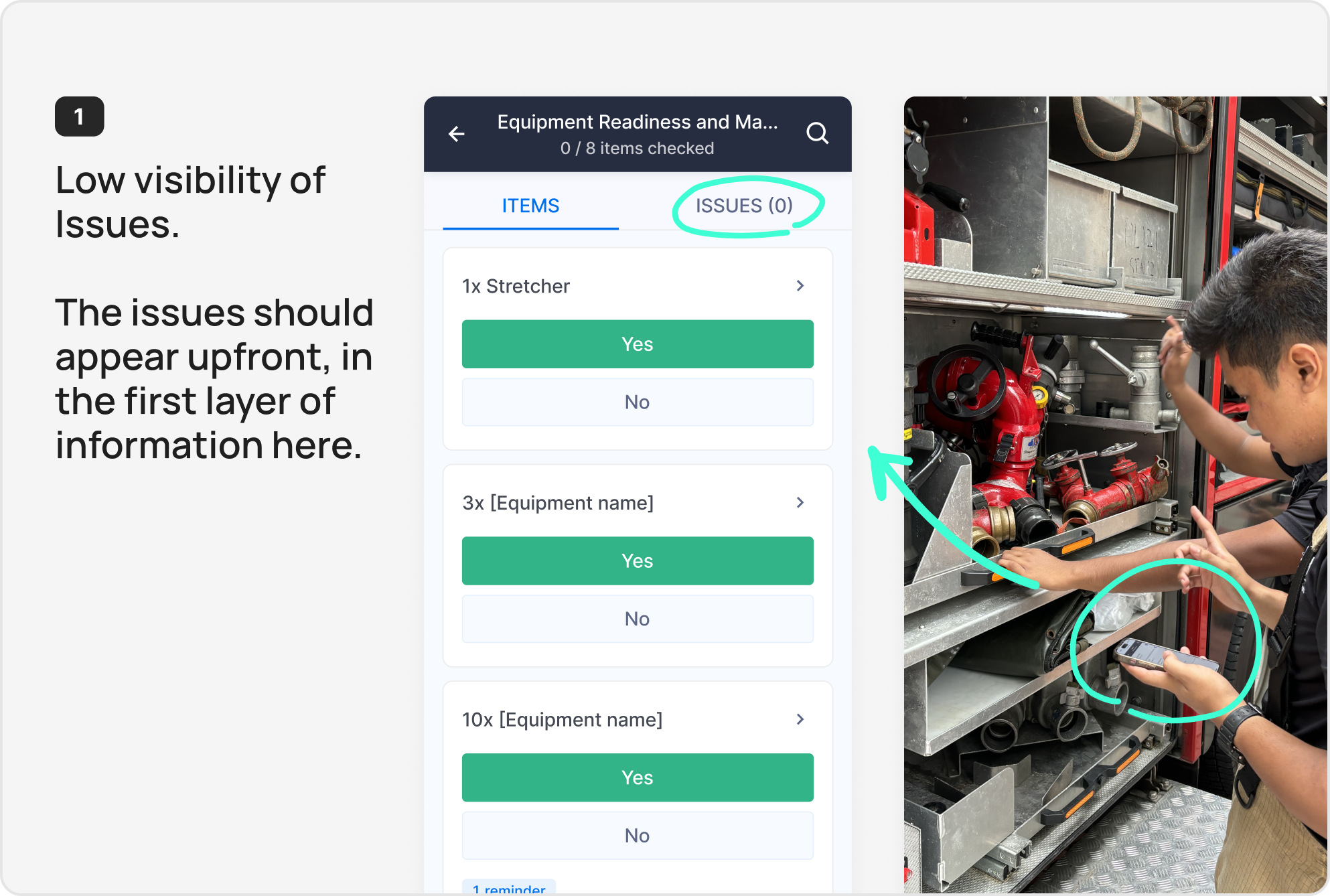
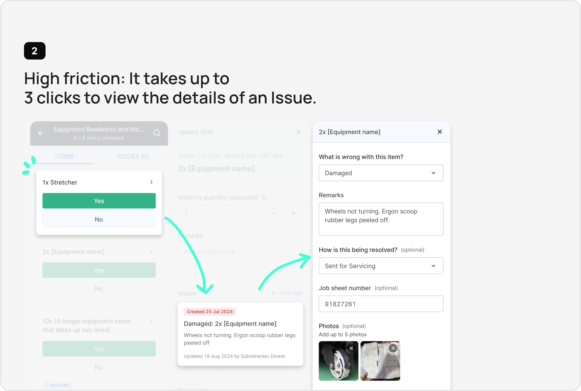
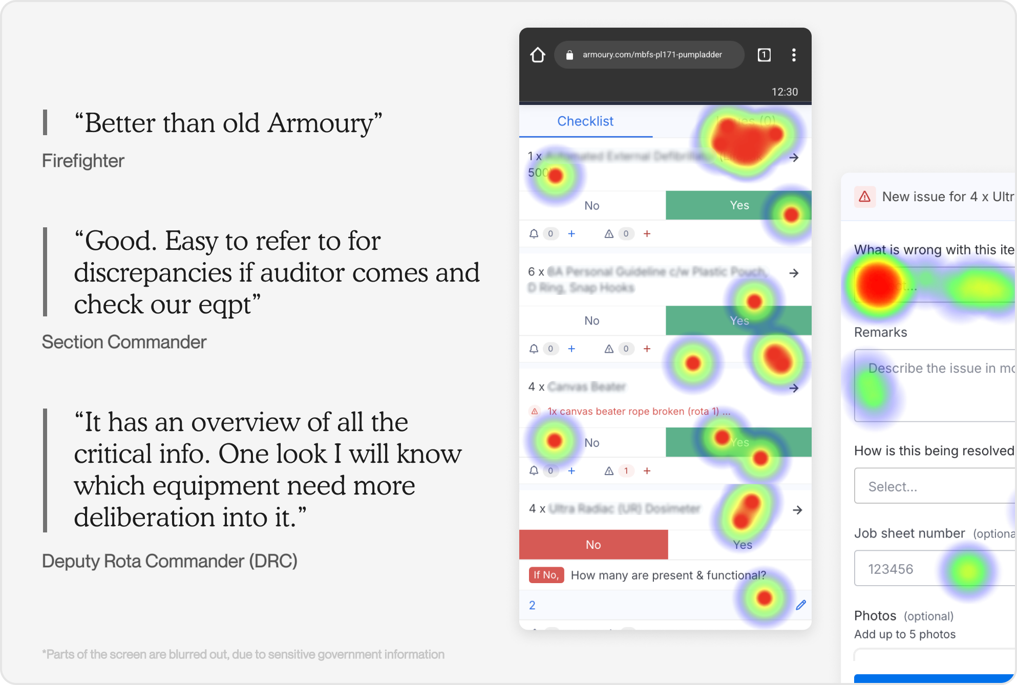
How might we help frontliners zoom in on items with issues quickly, and create better information scannability,
so that they can complete their checks as quickly as possible?
User Need 1
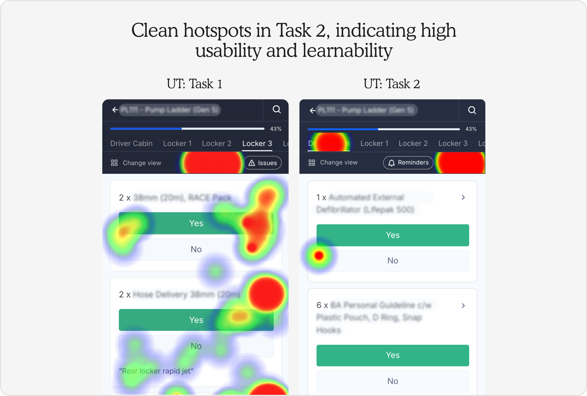
Firefighters and nurses need to focus only on the equipments with issues, rather than look through all the equipment 1 by 1.
"As we are quite familiar with the equipment, can fasten the checking time?"
"The "issue" part of the checking can be more straight forward."
User Need 2
Their main ask is to "fasten the checking time", as they want to complete their checks quickly and go back to saving lives.
"Simplify it and only show the things that have issues"
Pain points
Test 2
06
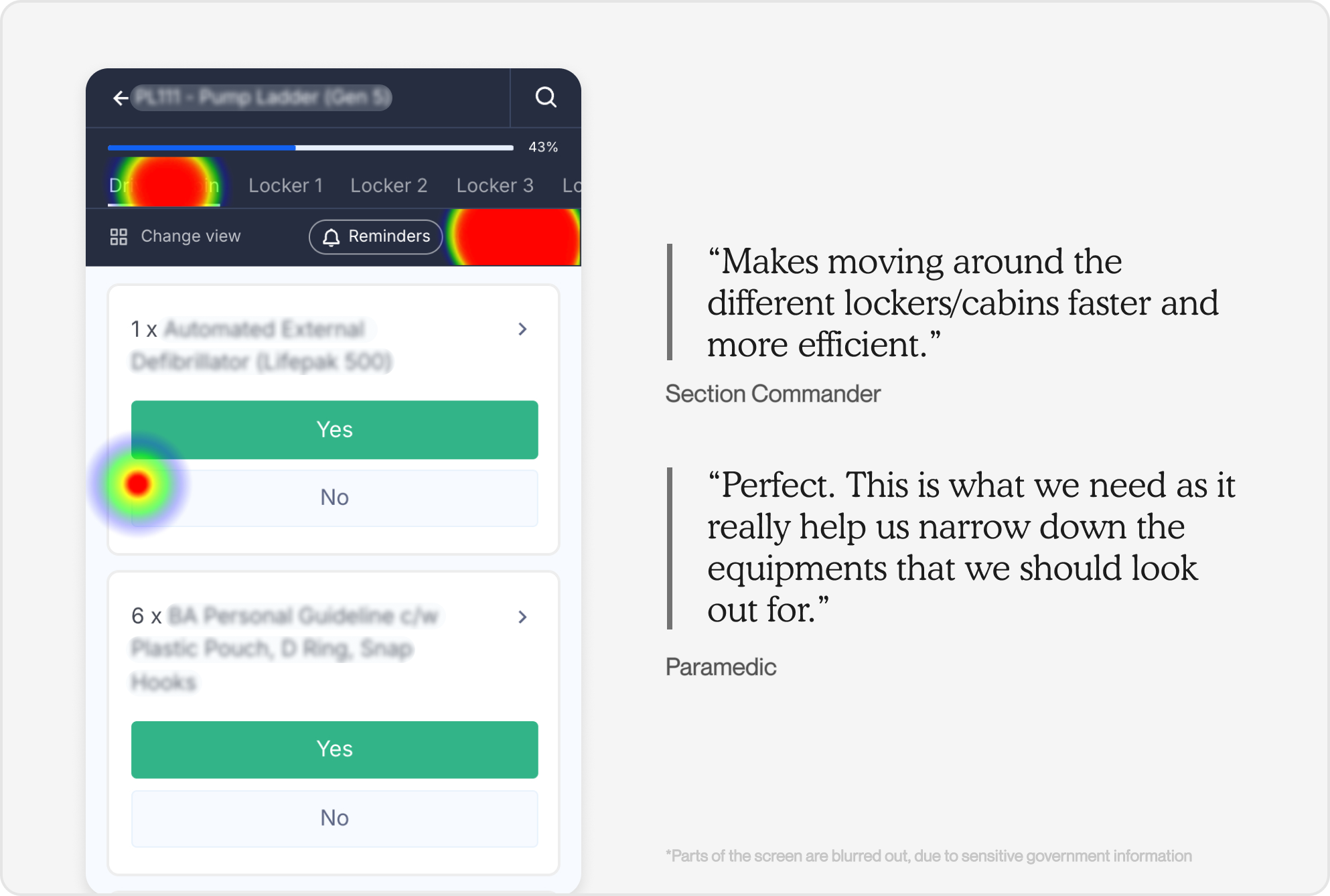
How might we make it easier to navigate and stay oriented in the checklist,
so they can easily locate items without feeling lost or fatigued?
User Need 1
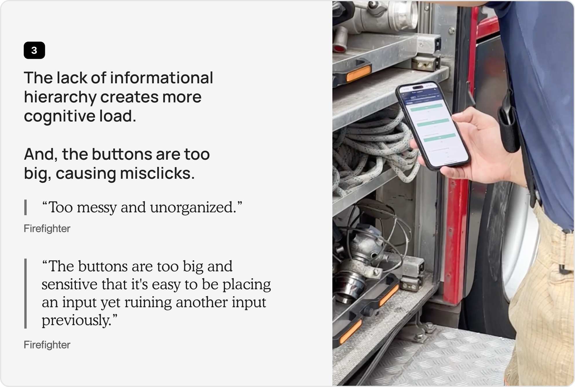
Being busy people, frontliners want to navigate and find sections and items quickly.
"(Troublesome) having to go back and forth between pages"
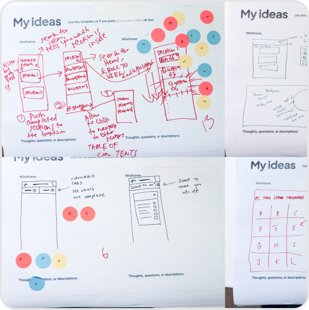
Solutions
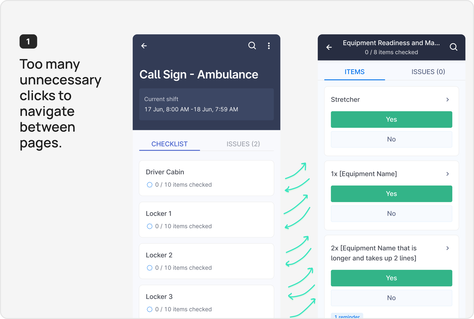
07 We achieved a 73%↓ reduction in task time, with only 6.8 seconds to complete the task with the enhanced designs.
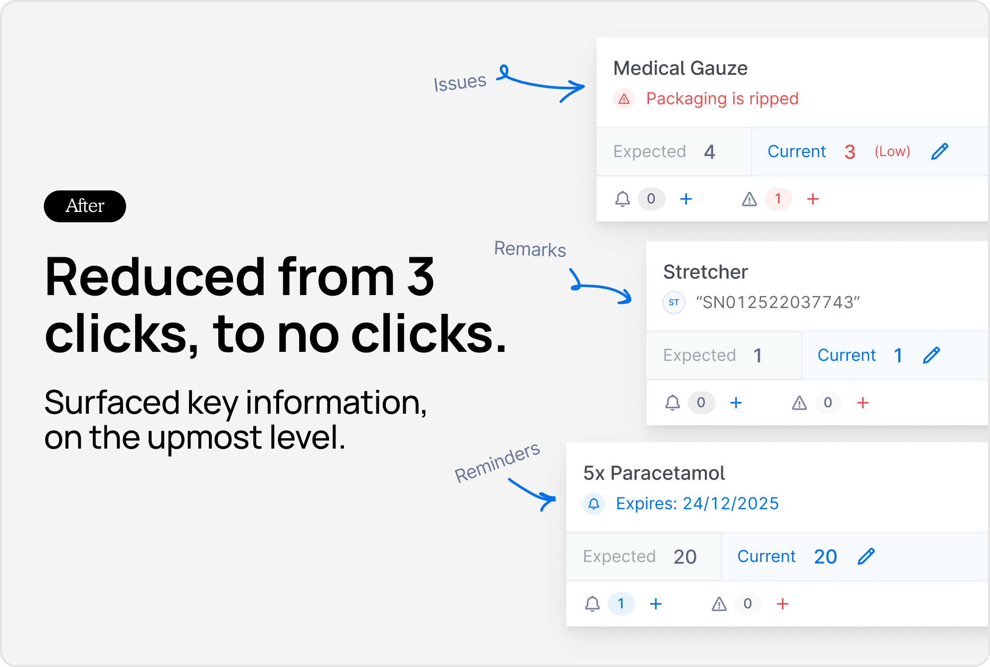
"Ability to set reminders and report issues more easily."
"As a logs rota, this is very useful."
Our satisfaction score increased to 4.3/5 during usability tests and pilots, and stayed at a stable 4/5 after the initial trials and pilots.
07 Bringing Product and Engineering, along the journey
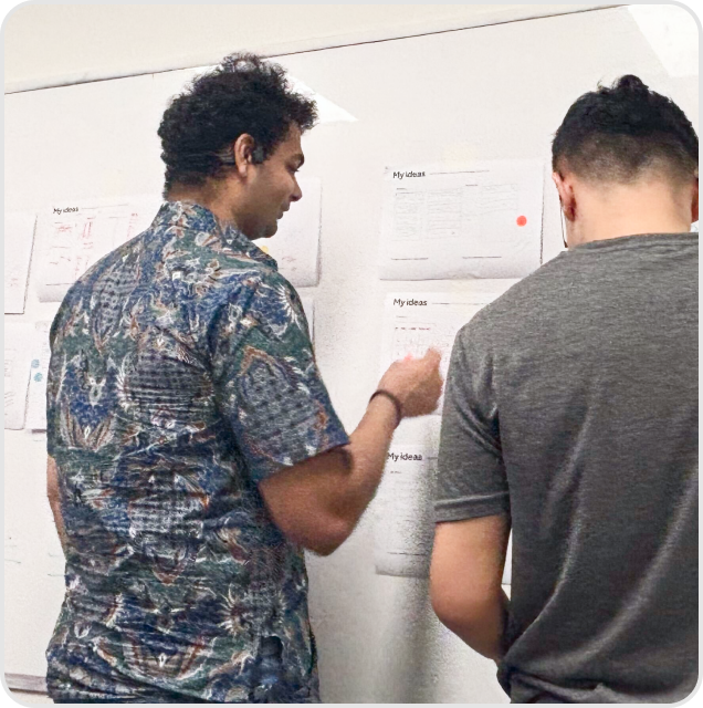
Closely collaborating with my engineers and PMs, was crucial to the success of this piece of work. Being able to create spaces where other functions felt comfortable to pitch in ideas, and work towards our goal together.
.png)